Olive
A health tech platform that centralizes user health data and leverages Epic’s market dominance.

Introduction
Olive is a health & wellness platform that empowers users to consolidate, control, and analyze their medical, fitness, and wellness data. By seamlessly interfacing with Epic’s MyChart, users can central their medical data and their cross-provider and provider-patient communication alongside their fitness and wellness application data.
Problem
Wellbeing is an integral human need. Yet keeping track of symptom, fitness, and mood data and making sense of diagnoses, treatments, and diagnostic tests is time-consuming, cumbersome, and often invasive.
Solution
A health tech platform which allows users to log, track, and analyze their symptoms, wellbeing metrics, and medical device data while allowing them to selectively share their data with their healthcare providers.
Understanding the market
Olive’s differentiation
MyChart’s market position is sufficiently strong that direct competition is not feasible. There is, however, an opportunity to lean upon MyChart’s strong position and leverage its 160 million users as Olive’s target user base (MyChart, “Homepage”).
Olive could provide user value as a product which subsumes wearable data, tracks wellbeing metrics, such as fitness, diet, mood, and mental health symptoms, and interfaces easily with MyChart to seamlessly import these metrics.
Impact of competitive analysis
Understanding the user
To understand Olive’s target audience, MyChart users, and to identify user problems Olive would need to solve, I conducted a survey and interviews.
My user research objectives were:
- Identify which health tech platforms users use, how they interact with these platforms and if participants have any unmet needs or pain points with their current health tech platforms.
- Identify user attitudes towards health data protection and consumer tech policy, and their degree of trust in their health tech platforms.
What users want
Integration
- Users want a centralization of cross-provider and provider-patient communication.
- Users want to aggregate all of their health, fitness, wellbeing, and medical data.


Provider communication
- Users want to communicate to their providers for non-urgent matters and send pre-appointment messages to their providers.
Understand, analyze, and control their data
- Users want to automatically track their health, fitness, wellbeing, and medical data over time and to observe trends through data visualizations.
- Users are willing to broadly share their data with their healthcare providers, but still want to be selective for more sensitive data.
- Users consider mental health and emotional state data more sensitive than fitness data.
- Users want their medical tests, like blood panels, explained to them in layman’s terms or with easy-to-parse visualizations.

Impact of user research
- Customizable dashboard – Centralizes cross-provider and patient-provider communications, displays upcoming appointments, tracks health routines, and visualizes health data.
- Messaging – A provider-patient message feature with data selection capabilities and a request for consent to share data.
- Data import – A health data upload feature for various kinds of data to enable record-keeping, sharing with providers, data analysis, and data visualization.
Drafting the wireframes
Onboarding
After account creation to demonstrate Olive’s value as a centralizing platform, I included four optional data import and third-party platform linking prompts.


Home




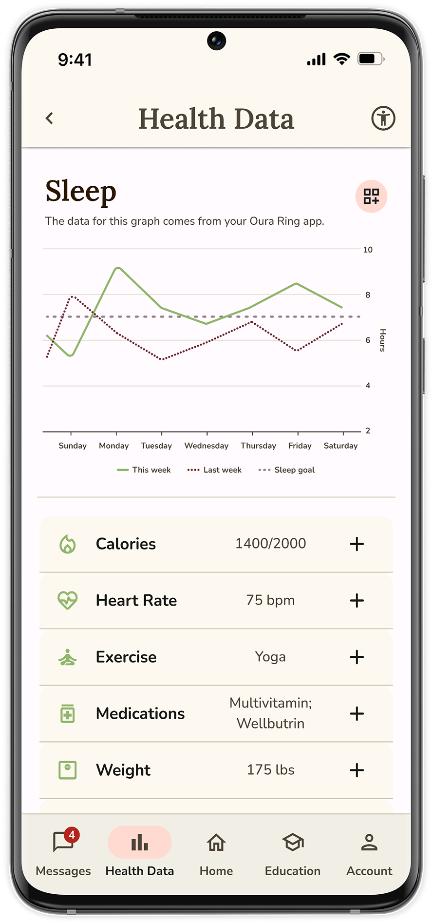
Universal symbol for digital accessibility sits in the top bar.
Tab navigation system as Olive has few yet equally important sections.
Customizable data bubbles to display user health data. Maximum 3 on mobile to accommodate smaller screens.
Cards display simple and recent health data, health goal progress, and task status information.
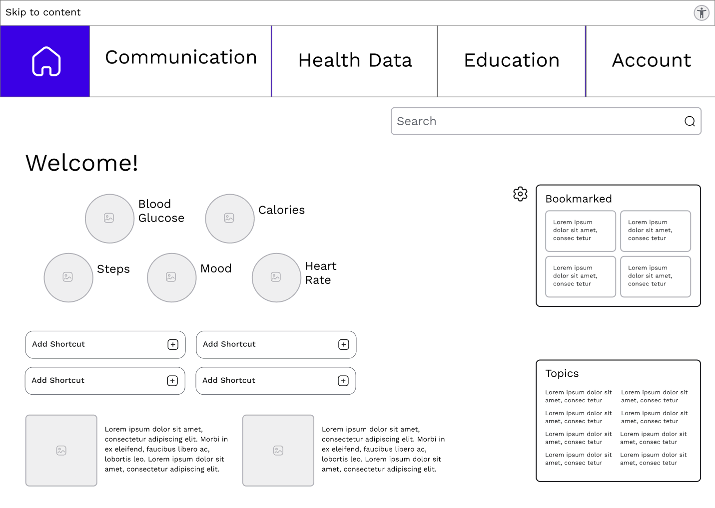


Slim accessibility bar with “Skip to Content” link for keyboard users.
Top tab navigation to leverage user familiarity with MyChart navigation.
Up to 5 customizable data bubbles on desktop.
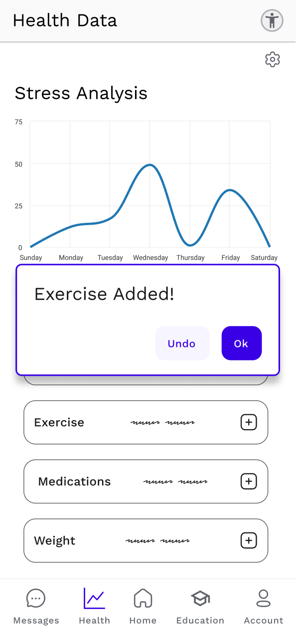
Uploading exercise data


Sending a message


Crafting the visual design
For Olive’s user interface, I studied and drew inspiration from Material Design’s design system.
Color
Olive’s color palette was curated to evoke trust, calm, and self-care in its users.
Trust - Getting users to trust Olive with their sensitive and intimate health information necessitates sincerity, wisdom, and competence (Labrecque & Milne 2012).
Calm - Stimulating relaxation and thoughtfulness enables users to feel a sense of calm when using Olive to manage often distressing health information (Labrecque & Milne 2012; Lupton 2017).
Self-care - Telegraphing health, wellbeing, and a touch of enjoyment stimulates users to be interested in taking care of their health (Lupton 2017).
Typography
Lora, with its serifs and calligraphic references, telegraphs respectability, knowledge, and trustworthiness (Cee 2022; Kastl & Child, 1968).
Lora
1234567890
abcdefghijklmnopqrstuvwxyz
ABCDEFGHIJKLMNOPQRSTUVWXYZ
Modern, sans-serif, Nunito’s rounded letters and curves evoke enjoyment, sincerity, and openness (Cee 2022; Kastl & Child, 1968).
Nunito
1234567890
abcdefghijklmnopqrstuvwxyz
ABCDEFGHIJKLMNOPQRSTUVWXYZ
Validating the solution
Usability testing
I conducted usability tests with the target users to validate my design decisions and to ensure Olive meets users needs.
After each test session, testers completed a 10-point System Usability Scale (SUS) questionnaire. Olive received an average SUS score of 76.7% - meaning that target users found Olive easier to use than 77% of other digital products.
Accessibility evaluation
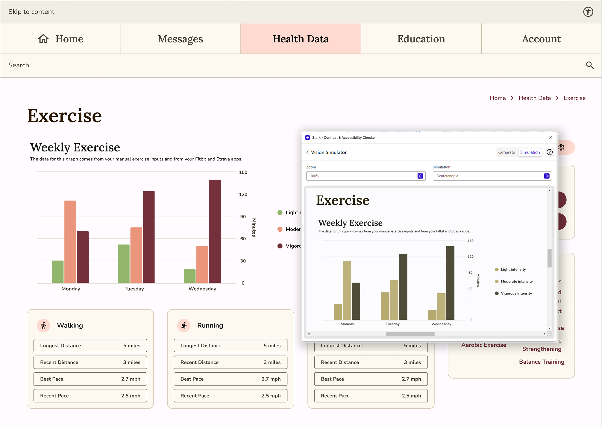
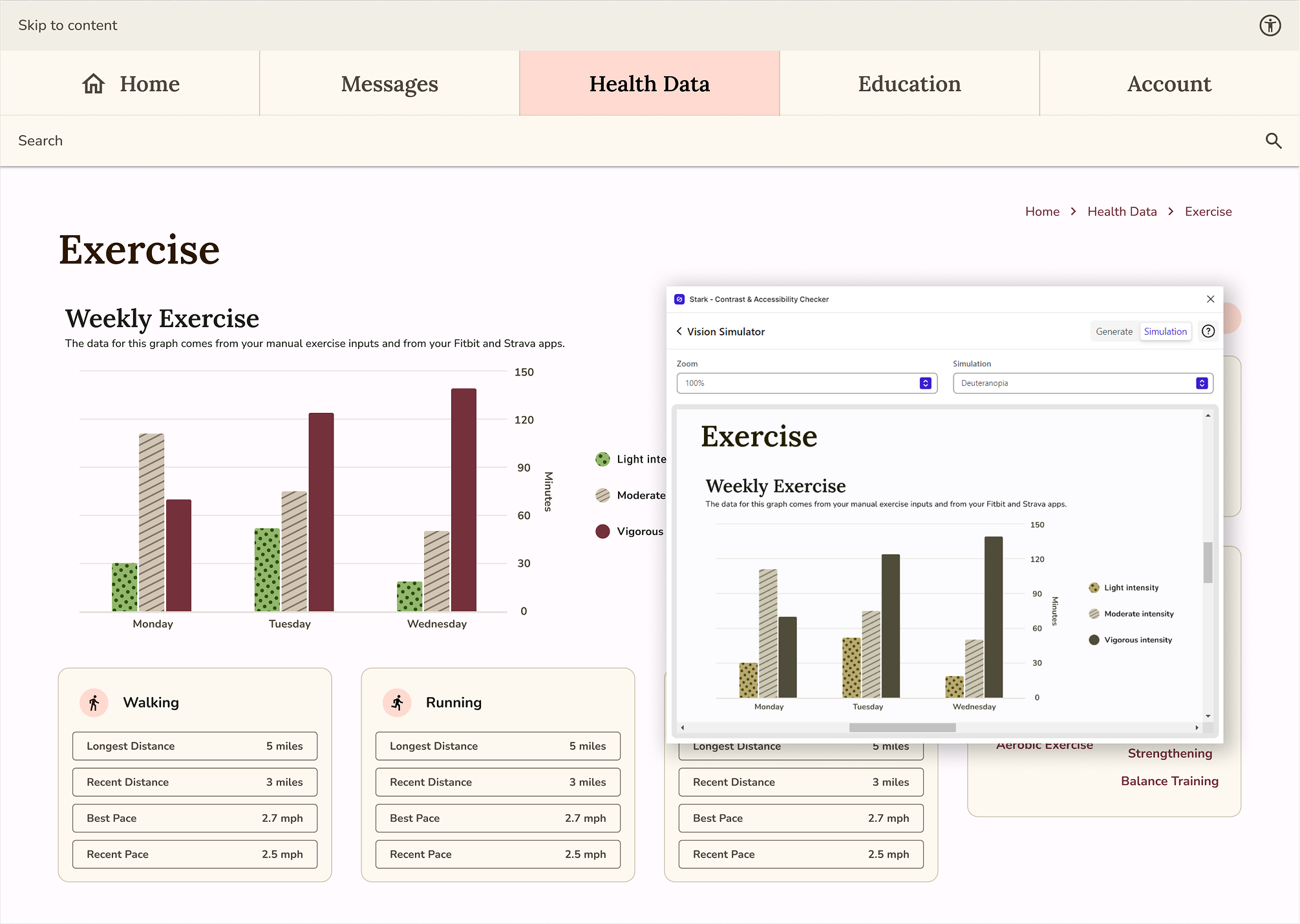
I conducted an accessibility analysis to ensure Olive could be utilized by diverse users. I strove for conformance to Level AAA of Web Content Accessibility Guidelines (WCAG) 2.1. Below is one example of the alterations I made.
Issue
The lines and bars of Olive’s charts were difficult to tell apart, especially for those with deuteranopia.
Resolution
I changed the color of one of the bars from a secondary color tone to a neutral tone, rendering it more discernible for those who easily confuse red and green.


Solution
“The mobile version feels really nice.”
- User
“Personalized health data bubbles makes it less dull and scary for a health platform.”
- User
Impact
With Olive, I created a health tech platform that:
- Inspires trust, calm, and self-care with its color palette and UI patterns.
- Empowers users to control and understand their health and wellbeing.
- Leverages a competitor’s market advantage to target 160 million potential customers.
- Users found easier to use than 77% of digital products.
What I learned
Tools & techniques
- Researching and designing Olive was the first time I used many of the tools and techniques discussed, including software, such as Figma, Crowdsignal, and Optimal Workshop, as well as frameworks and processes such as user personas, user journeys, user flows, content audits, and site maps. Learning how to navigate new software and conceptualize novel approach while trying to deploy them effectively and efficiently is an immense challenge.
- Not only am I now proficient in these software platforms, I have developed confidence in my ability to understand and quickly learn to deploy new methodologies.
Visual design & perfectionism
- Selecting Olive’s typography and color palette and designing Olive’s UI elements activated my perfectionist impulses. I began overanalyzing the significance and impact of every UI decision, even ultimately inconsequential ones. Olive was an excellent opportunity for me to learn to put into practice the mantra “done is better than perfect”.
- Through the visual design process for Olive, I learned more effective techniques of recognizing obsessive over-analysis and how to disengage myself from these patterns.
Footnotes
MyChart. “Homepage.” 2023, from: https://www.mychart.com/.
Labrecque, L. I. & Milne, G. R., (2012). Exciting red and competent blue: the importance of color in marketing. Journal of the Academy of Marketing Science, 40, 711–727. https://doi.org/10.1007/s11747-010-0245-y
Lupton, Ellen. (2017). Design is Storytelling. Cooper Hewitt, Smithsonian Design Museum.
Kastl, A. J., & Child, I. L. (1968). Emotional meaning of four typographical variables. Journal of Applied Psychology, 52(6, Pt.1), 440–446. https://doi.org/10.1037/h0026506
Cee, Dora (August 4, 2022). Becoming type-sensitive with font psychology. UX Collective, from https://uxdesign.cc/getting-type-sensitive-with-the-psychology-of-fonts-8e8758d70433